Understanding the Importance of Presentation Design
In today’s visually-driven world, the design of a presentation can be as crucial as the content itself. Presentation design refers to the process of creating visually appealing slides that effectively communicate a message to an audience. A well-designed presentation captures the audience’s attention, enhances the speaker’s message, and helps convey complex information in a digestible manner. On the other hand, a poorly designed presentation can lead to confusion, boredom, and even misunderstandings. Understanding the importance of presentation design is the first step toward creating impactful presentations that leave a lasting impression on your audience.
Presentation design involves more than just arranging text and images on slides. It requires a thoughtful consideration of elements such as layout, color schemes, typography, and visual hierarchy. Each of these components plays a vital role in guiding the audience’s focus and ensuring that the presentation flows smoothly. By mastering these design principles, presenters can create slides that not only look professional but also effectively support their narrative, making their message more persuasive and memorable.
Choosing the Right Tools for Presentation Design
Selecting the right tools is a critical aspect of presentation design. Numerous software options are available, each with its own set of features and capabilities. PowerPoint, for example, is a widely used tool that offers a variety of templates and customization options. Canva, on the other hand, is known for its user-friendly interface and extensive library of design elements. Keynote, preferred by many Mac users, provides a sleek, minimalist design aesthetic. Understanding the strengths and limitations of each tool can help you choose the one that best suits your needs.
Once you’ve chosen your tool, it’s essential to familiarize yourself with its features and capabilities. Learning shortcuts, understanding how to manipulate design elements, and exploring advanced features can significantly enhance your efficiency and the quality of your presentation design. Additionally, consider using design resources such as stock images, icons, and fonts to elevate the visual appeal of your slides. With the right tools and resources at your disposal, you can create a presentation that stands out and effectively communicates your message.
Crafting a Cohesive Visual Theme
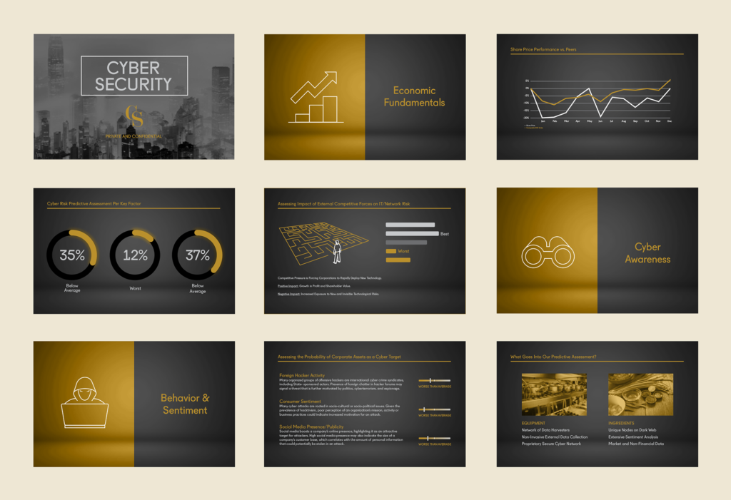
A cohesive visual theme is a key component of effective presentation design. Consistency in design elements such as colors, fonts, and imagery helps to create a unified look that reinforces the presentation’s message. When crafting a visual theme, it’s important to consider the overall tone and purpose of the presentation. For example, a corporate presentation might benefit from a clean, professional theme, while a creative pitch could use bold colors and unique typography to capture attention.
To achieve a cohesive visual theme, start by selecting a color palette that complements your content and aligns with your brand or message. Stick to a limited number of fonts, ideally one for headings and another for body text, to maintain consistency. Additionally, ensure that your images and graphics are of high quality and align with the overall theme. By paying attention to these details, you can create a visually cohesive presentation that is both aesthetically pleasing and effective in delivering your message.
Enhancing Engagement with Interactive Elements
Interactive elements can significantly enhance the engagement and effectiveness of your presentation. Incorporating elements such as hyperlinks, embedded videos, animations, and interactive charts can transform a static presentation into a dynamic experience. These features not only capture the audience’s attention but also provide opportunities for them to interact with the content, making the presentation more memorable.
When adding interactive elements, it’s important to strike a balance between functionality and design. Overuse of animations or interactive features can become distracting and detract from the main message. Instead, use these elements strategically to highlight key points, demonstrate concepts, or provide additional information. For example, an embedded video can be an excellent way to showcase a product demo, while interactive charts can help illustrate complex data in an engaging and easy-to-understand manner. By thoughtfully incorporating interactive elements, you can create a presentation that is both engaging and informative.
Finalizing and Refining Your Presentation
The final step in presentation design is refining your slides to ensure they are polished and error-free. This involves reviewing the content for clarity, checking for spelling and grammar errors, and ensuring that the design elements are aligned and consistent. It’s also important to test the presentation on different devices and screen sizes to ensure it displays correctly in various settings.
Another critical aspect of finalizing your presentation is rehearsing the delivery. Practicing your speech in conjunction with the slides can help you identify any areas where the design might need adjustment for better flow or clarity. Additionally, seek feedback from colleagues or peers to gain a fresh perspective on your presentation’s design and content. By taking the time to finalize and refine your presentation, you can ensure that it is professional, impactful, and ready to impress your audience.
Conclusion
Mastering presentation design is an essential skill for anyone looking to communicate effectively in a professional setting. By understanding the importance of design, choosing the right tools, crafting a cohesive visual theme, enhancing engagement with interactive elements, and thoroughly refining your presentation, you can create visually stunning slides that support and enhance your message. With these principles in mind, you are well on your way to delivering presentations that leave a lasting impression.

